When people look for help with addiction, they often start online. Families and patients search for answers in moments of fear or stress. A website can either guide them toward hope or push them away.
Nearly 60% of U.S. adults go online to find health information, which shows how important these first impressions really are. That’s why rehab marketing must focus on building trust and making the next step simple.
After looking closely at 50 different rehab websites, we found a big problem: only 3 made it easy for visitors to act.
Why Rehab Websites Matter
A rehab website is more than an online brochure. It can be the first place someone goes when they decide to seek help. That moment matters. If the website does not guide them clearly, they may leave and look somewhere else.
Here are the main reasons rehab websites matter:
- First impressions count. A family looking for care often feels stressed. If a site looks old, slow, or unclear, it may push them away.
- Trust is key. People want to see proof of care. That can mean staff bios, treatment details, and real photos of the center.
- Easy next steps save time. Clear “Call Now” buttons or short forms help people take action quickly.
Strong websites also help programs grow. Good design and structure connect to larger efforts like drug treatment marketing and building a safe online presence. Without that, a center can lose both trust and visibility.
A solid website is also part of marketing rehab on search engines and in ads. A site that runs well supports ads, social campaigns, and local maps. That means more people can find the right help at the right time.
The impact is simple: every rehab website is a doorway. If the doorway is easy to walk through, more people enter. If it is blocked or confusing, they turn away.
What Most Rehab Sites Do Wrong
Out of 50 sites, 47 struggled. The issues were common, and most could be fixed. Here are the main mistakes:
- Poor speed. Many sites loaded slowly on mobile phones. This caused visitors to quit before the page even finished.
- Hidden phone numbers. Instead of a big “Call Now” button, some sites tucked numbers in the footer. Families had to search hard.
- Too much text. Many sites had long paragraphs with confusing terms. People in crisis do not want to read a wall of words.
- Weak trust signals. Some sites missed proof of licenses or accreditations. This raised doubt.
A full website audit often reveals these gaps. By running a tool to check website SEO, you can see broken links, slow pages, and weak keywords. Without fixing these basics, it’s hard to rank or convert.
Another issue was poor tracking. Centers did not measure results. Without a marketing KPI dashboard, owners cannot see what works. They may spend money on ads, but never know if calls or forms came from them.
Finally, many centers failed at local search. They ignored local SEO for rehab centers, leaving their map listings incomplete. If someone searched “rehab near me,” their center did not show up. That lost traffic and trust.
Most mistakes were avoidable. They showed that many centers built a website once but never updated it. Without care, the site aged poorly, and the conversion rate stayed low.
What Makes a Site Work?
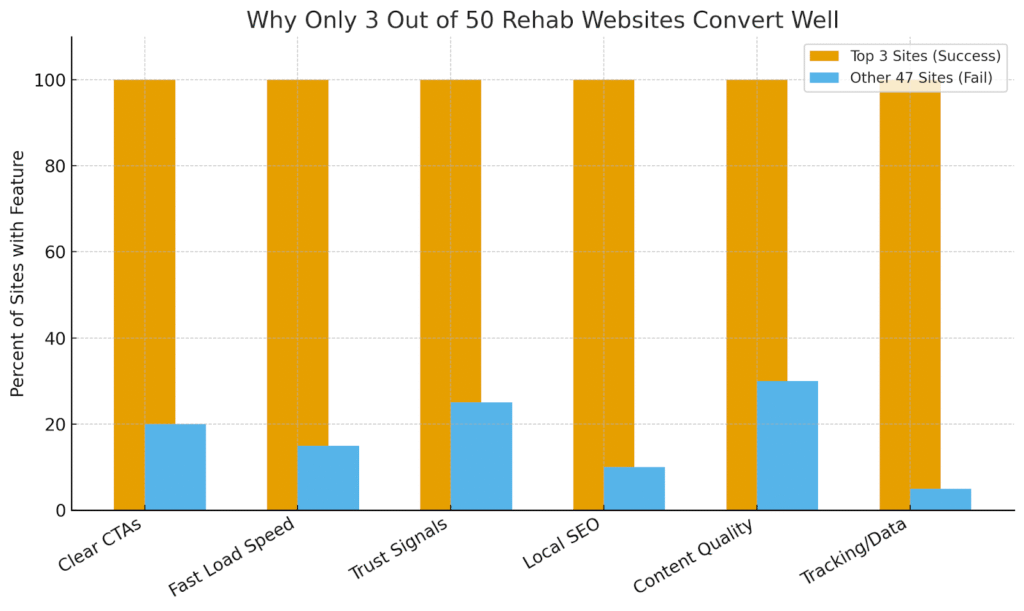
The 3 top websites had clear strengths. They showed what works when design, trust, and action come together.
Here are the main traits of high-converting rehab sites:
- Simple design. The home page was clean. The message was direct: “Call us now for help.”
- Fast load speed. Each site opened within a few seconds, even on mobile.
- Strong trust signs. They showed real staff, accreditation badges, and clear treatment programs.
- Direct calls to action. Buttons like “Verify Insurance” or “Get Help Now” stood out in large text.
The best sites also built a clear lead generation funnel. This meant every visitor had an easy path:
- Call directly.
- Fill out a short form.
- Chat with staff in real time.
Each path respected privacy and was easy to use.
These sites also had clear content. They explained treatment types, what to expect, and how families could support loved ones. The words were short and calming. They gave hope while guiding visitors toward the next step.
Finally, the top sites tracked results. They measured calls, form fills, and chats. They checked reports often to keep improving. This cycle of measure and adjust made them stronger over time.
In the end, good websites worked because they respected the visitor’s state of mind. They made help easy to find, trust easy to build, and action easy to take.
Why Only 3 Out of 50 Rehab Websites Convert Well
When we looked at 50 rehab websites, only 3 stood out. The rest had problems that kept people from calling, filling out forms, or trusting what they saw.
Let’s dig a bit deeper and break down why these sites failed and why a small group succeeded.
1. The Role of First Impressions
A visitor often lands on a rehab site during a stressful moment. Families and patients want fast answers. They want to feel safe right away.
- A clear headline is the first sign of trust. Sites that said “Get Help Today” or “Call 24/7” made it easy to understand the next step.
- Large buttons for calls or forms gave visitors a quick way to act.
- Real photos of staff and facilities helped people believe the program was real.
The 3 winning sites gave people confidence in seconds. Most of the others took too long to explain who they were or how to reach out.
2. Why Speed Matters
Slow websites lose visitors fast. Many of the 47 poor sites loaded in 6 to 8 seconds on mobile. In today’s world, that feels like forever.
- Good sites loaded in 2 to 3 seconds.
- Images were compressed without losing quality.
- Pages did not jump around while loading.
Speed is more than a technical detail. It connects directly to rehab marketing success. If people leave before a page shows, no ad or campaign can save the visit.
3. Missing or Hidden Calls to Action
A call to action is a simple button or message that guides the visitor. It might say “Call Now,” “Verify Insurance,” or “Get Help.”
The top 3 sites made these calls big and bold. They appeared at the top of the page and repeated as visitors scrolled.
In the weaker 47 sites:
- Phone numbers were small and placed in the footer.
- Some forms were long and asked for too much personal data.
- Live chat boxes appeared but were hidden on mobile.
Without clear calls to action, visitors had no direction. They clicked away.
4. Weak Trust Signals
Trust is the heart of any medical or care website. Visitors want to know they are talking to real professionals.
The strong 3 sites showed:
- Accreditation logos, like The Joint Commission or CARF.
- Staff names, photos, and job titles.
- Simple details about treatment, daily schedules, and family support.
By contrast, many of the 47 weak sites looked like generic brochures. Some used stock photos of smiling people. Others had no proof of staff or credentials. This left visitors asking, “Is this place even real?”
This is where drug treatment marketing and site content connect. Honest details build credibility and encourage action.
5. SEO and Local Search Problems
A strong website is easy to find on Google. The top sites had complete local SEO for rehab centers in place. That meant:
- Updated Google Business Profiles with hours and photos.
- Consistent names, addresses, and phone numbers across listings.
- Pages that mentioned city names and nearby areas.
The 47 other sites failed here. Many were missing business profiles. Some had outdated addresses or wrong phone numbers. Others lacked pages for each location.
Without local optimization, even the best site design loses impact. People searching “rehab near me” never saw them.
6. Poor Content Choices
Content is more than words on a page. It tells the story of who you are and what you provide.
The strong 3 sites used simple, clear writing. They explained:
- The types of treatment available.
- What to expect on the first day.
- How families can be part of recovery.
The weaker 47 sites often had:
- Walls of text filled with medical terms.
- Vague promises like “We change lives” without proof.
- Blog posts copied from other sites.
This kind of content does not help someone in crisis. People want fast, clear answers written in plain language.
7. Tracking and Data
Another gap was measurement. Many sites had no way to track results. Without data, owners cannot know what works.
The best 3 sites used tools to:
- Count calls from the site.
- Track form fills.
- Watch how visitors moved through pages.
This information helps teams see if changes improve results. It also supports a smart website audit. A good audit reviews design, speed, SEO, and calls to action together.
If you check website SEO and do not also check conversion paths, you miss the full picture. That is why the winning sites tracked everything in one system.
8. Privacy and Compliance
Healthcare websites must protect visitor data. People share private details, so sites must follow rules like HIPAA.
The strong sites:
- Kept forms short and secure.
- Used clear consent for chat and text features.
- Avoided risky tracking tools on sensitive pages.
Some weak sites asked for too much, like Social Security numbers or long medical histories. Others used generic contact forms with no security. This scared away visitors and created legal risks.
9. The Role of Design
Design does not mean flashy graphics. It means clear layout, easy navigation, and a calming look.
The 3 strong sites used:
- Simple menus with no clutter.
- Large fonts that were easy to read.
- Calming colors and images of real spaces.
The weaker 47 often overloaded pages with pop-ups, ads, or sliders. Visitors in crisis do not want to play a guessing game. They want one clear path.
10. Why Most Sites Fail
Looking across all 50, the main reasons for failure were:
- Slow speed.
- Hidden calls to action.
- Weak or fake trust signals.
- Bad SEO and missing local presence.
- Poor content with vague promises.
- No tracking or privacy safeguards.
The 3 that worked fixed these issues. They respected the visitor’s time, showed proof, and made action simple.
11. What Success Looks Like
To sum it up, a strong rehab website needs to:
- Load fast on all devices.
- Show trust with real proof and staff details.
- Use clear, bold calls to action.
- Support local search with accurate listings.
- Offer simple, useful content.
- Protect privacy and follow compliance rules.
- Track results for ongoing improvement.
This mix connects marketing rehab efforts with real outcomes. It helps families find help faster and gives centers the tools to grow responsibly.
Conclusion
We saw a clear divide. Most rehab websites failed to guide visitors, but a few got it right. Those top 3 sites showed that clear design, trust, and speed lead to better results. A strong online presence also supports rehab marketing across ads, search, and referrals.
If you want to make your rehab site work harder, focus on building trust and reducing friction.
For expert help in improving your website and driving real results, reach out to Aelle Digital Marketing today.
Frequently Asked Questions
What is the best first step to improve a rehab website?
Run a website audit to find slow pages, broken links, and missing content. Fixing these basics can raise both trust and traffic.
How can rehab centers track online success?
Use a marketing KPI dashboard to measure calls, form fills, and traffic sources. This shows what’s working.
Why do people leave rehab websites quickly?
Slow speed, hard-to-find phone numbers, and unclear messages make visitors quit before taking action.
Do reviews help rehab websites?
Yes. Reviews on Google and other sites build trust and help with local SEO for rehab centers.
How often should a rehab site be updated?
Check content and speed every few months. Update staff info, add fresh photos, and review SEO at least twice a year.