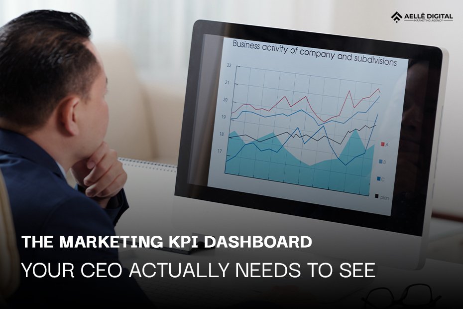
Most marketing dashboards are built by marketers for marketers. That’s great… if you’re a marketing team. But what happens when your CEO logs in? Their eyes glaze over. Too many charts. Too much jargon. Not enough answers.
That’s a problem, especially since over half of marketing leaders say the main reason to have a dashboard is to help people make smarter decisions. But if the data isn’t clear or useful to leadership, that goal gets lost.
This article is here to fix that. We’ll walk through what a Marketing KPI Dashboard really should look like—especially if you want leadership to actually care. We’ll also explain why most dashboards miss the mark, and how to design one that delivers real insights fast.
Regardless if you work in a startup, a rehab marketing agency, or a major healthcare brand, this will help you speak your CEO’s language.
Table of Contents
What is a Marketing KPI Dashboard?
A Marketing KPI Dashboard is a tool that shows how well your marketing is working. It tracks your most important numbers—called key performance indicators (or KPIs). These numbers help you measure progress, spot trends, and make better decisions.
Here’s what it usually includes:
- Leads and conversions – How many people are signing up or buying?
- Traffic sources – Where are your website visitors coming from?
- Ad performance – How are your pay per click advertising campaigns doing?
- Budget tracking – Are you getting the most out of your ad budget optimization?
It’s a clear, at-a-glance view of what’s working—and what isn’t.
Dashboards can also focus on specific goals. For example, in healthcare marketing, you might build one around healthcare KPIs like patient appointment volume or cost per lead. Or in eCommerce, you might look at return on ad spend.
You can use a KPI tracker to collect and display all this data in one place. The goal is to save time, reduce confusion, and help your team take smart action fast.
Why Most Marketing Dashboards Fail Executives
Now here’s the problem: most dashboards just aren’t built with executives in mind.
They’re often too detailed or too vague. They show too much data—or the wrong kind. And they make it hard for a CEO to answer one simple question:
“Are we growing the business or not?”
Let’s break down some common reasons why dashboards fail:
1. They’re made for marketers, not decision-makers
You might care about Google Ads KPIs like click-through rates or impressions. But your CEO? They want to know if those ads are driving sales.
2. They bury the signal in noise
A good performance dashboard highlights key outcomes. Not 23 graphs with four colors each. When everything’s important, nothing is.
3. There’s no story
Data without context just looks like… numbers. Great dashboards show how results tie back to strategy.
4. They’re never updated
Stale dashboards lead to stale decisions. If your data isn’t current, your decisions won’t be either. That’s where a regular KPI audit helps. It keeps your metrics fresh and relevant.
Bottom line: if a CEO needs a 20-minute walkthrough just to understand the dashboard, it’s already failed.
What a CEO-Ready Marketing Dashboard Looks Like
So now you know what a marketing KPI dashboard is, and why many just don’t work for leadership. Let’s talk about what does work. A CEO-ready dashboard is simple, clear, and focused on results. It doesn’t try to impress. It tries to inform.
Here’s what makes a dashboard easy for a CEO to understand—and act on.
1. It Starts with Business Goals
First things first: the dashboard needs to match what your company is trying to do.
- If your goal is more leads, your dashboard should show lead growth.
- If your goal is more revenue, your dashboard should show revenue impact.
- If you’re in a hospital or clinic, your dashboard might include healthcare KPIs like appointment requests or patient acquisition cost.
The best dashboards don’t make the CEO guess. They answer questions right away, like:
- Are we meeting our monthly goals?
- What’s driving results?
- What needs attention?
When your performance dashboard is built around business goals, your CEO stays focused and confident.
2. It Shows Only the Most Important Numbers
You don’t need 40 metrics. You need the right ones.
A CEO-ready dashboard usually includes:
- Top-level KPIs (like leads, revenue, or ROI)
- Cost per lead or cost per acquisition
- Channel performance (e.g., paid search, organic, email)
- Ad spend vs. results (great for Google Ads KPIs)
- Conversion rates by funnel stage
The key is to avoid overload. Each number should have a purpose. If your kpi tracker is measuring something, it needs to help answer, “Are we growing the business?”
Example:
Let’s say you’re at a Rehab Marketing Agency helping clinics book more evaluations. Your CEO dashboard might show:
- Monthly ad spend
- Leads from paid ads
- Cost per lead
- Booked appointments
- Show-up rate
That’s it. Clean. Actionable. No fluff.
3. It’s Visual and Easy to Scan
Busy leaders don’t have time to dig through spreadsheets. A CEO dashboard should be easy to read in under 60 seconds.
Use:
- Clear charts and graphs
- Bold labels
- Green for good, red for warning
- Simple, plain-language headings
It helps to group similar data together. That way, a CEO can move through each section quickly. For example:
Section 1: Overall Marketing Performance
Section 2: Paid Ads Breakdown
Section 3: Website & Funnel Metrics
A good dashboard is like a quick daily check-in. If something’s off, it should be obvious right away.
4. It Updates Often and Accurately
A CEO can’t make smart decisions if the numbers are old or wrong.
Make sure your kpi dashboard updates in real-time—or at least daily. This helps your leadership team stay on top of changes, especially during busy campaigns.
Also, plan for a KPI audit every few months. This helps you clean out unused metrics, fix errors, and adjust for new goals. It also helps keep your kpi tracker focused on what really matters.
5. It Tells a Clear Story
Your dashboard should answer three things clearly:
- What’s happening?
- Why is it happening?
- What do we do next?
You don’t need to write a full report, but you can include short notes or color-coded trends. For example:
“Cost per lead has gone down 15% this month after ad budget shift to Google Ads.”
It helps your CEO connect the dots. And when they see the logic, they’re more likely to support your ideas and back your strategies.
Summary: CEO-Ready Dashboard Checklist
✅ Matches business goals
✅ Shows key KPIs only
✅ Easy to scan and read
✅ Updated and reliable
✅ Explains what’s working and what needs action
When you build your performance dashboard with these things in mind, you’ll give your CEO exactly what they need—confidence, clarity, and control.
Conclusion
If you want your CEO to actually care about your marketing dashboard, it needs to speak their language. Keep it focused. Make it simple. Show outcomes. The right KPI dashboard isn’t just about data—it’s about trust, alignment, and growth.
And if you’re tired of dashboards that don’t deliver, we can help. At Aellē Digital, we build custom dashboards that get attention in the boardroom—and drive action on the ground.
Let’s build something smarter together.
FAQs
1. What’s the difference between a KPI dashboard and a KPI tracker?
A tracker collects data; a dashboard organizes and displays that data in a visual way.
2. How often should we do a KPI audit?
Every quarter is a good start, but monthly is even better if you run a lot of campaigns.
3. Can a dashboard include data from Google Ads KPIs?
Yes! You can track impressions, clicks, conversions, and cost-per-click.
4. What tools help with ad budget optimization?
Platforms like Google Ads and Meta Ads Manager include budget tools. Use dashboards to monitor results.
5. Are dashboards different for healthcare marketing?
Yes. Healthcare KPIs may include patient acquisition cost, appointment requests, and referrals.