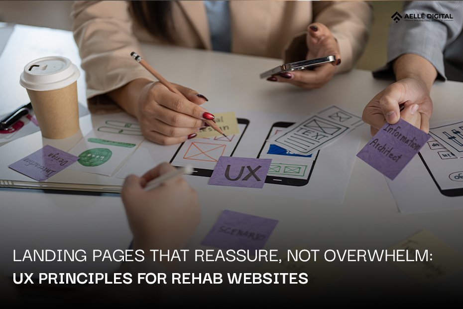
When someone searches for addiction treatment, they’re often scared, desperate, or searching for help for a loved one. Your website might be the first place they turn during one of the hardest moments of their lives.
The wrong rehab website design can make them leave before they even read about your services. The right design can guide them toward hope and healing. Every color, word, and button matters when someone needs help now.
Key Takeaways
The best rehab website design creates calmness, builds trust, and makes it easy to get help without pushing too hard or sharing too much information at once. Focus on simple layouts, calming colors, clear words, visible contact options, and real stories that show recovery is possible.
| Design Element | What To Do | Why It Matters |
| Layout | Use clean, simple designs with white space | Reduces stress and confusion |
| Colors | Choose blues, greens, and earth tones | Creates feelings of calm and safety |
| Language | Write in plain, everyday words | Makes information easy to understand |
| Contact Options | Make phone numbers and forms easy to find | Helps people reach out quickly |
| Testimonials | Share real recovery stories | Builds trust and hope |
| Mobile Design | Make everything work on phones | Many people search privately on mobile |
Ready to transform your treatment center’s online presence? Aelle Digital specializes in creating compassionate, conversion-focused websites for addiction treatment centers.
Table of Contents
Why First Impressions Matter When Someone Needs Help
Your website has about five seconds to make someone feel safe. That’s how long most people decide if they’ll stay or leave. When someone visits a rehab website, they’re usually anxious, scared, or overwhelmed. They might be shaking. They might be crying. They need to feel like they found the right place fast.
A good first impression starts with what people see right away. Here’s what matters most:
- Clean, uncluttered homepage that doesn’t throw fifty things at them at once
- Calming colors that make them take a deep breath instead of feeling more stressed
- Clear headline that speaks directly to their pain and offers hope
- Visible phone number they can call right now without hunting for it
- Real photos of your facility and staff, not fake stock images
Think about walking into a doctor’s office. You want it to feel clean, professional, and welcoming. The same goes for drug rehab website design. If your site feels chaotic or pushy, people will leave. If it feels calm and trustworthy, they’ll keep reading.
The stakes are higher here than with other websites. Someone shopping for shoes can come back tomorrow. Someone looking for addiction treatment might not. They might lose courage. They might give up. Your website needs to catch them in that moment when they’re ready to ask for help.
First impressions also affect families. Parents, spouses, and adult children visit these sites feeling guilty, worried, or desperate. They need reassurance that you understand what they’re going through. They need to believe you can help their loved one.
The Problem: Too Many Rehab Websites Make Things Harder
Many rehab websites accidentally push people away. They make the same mistakes over and over. These mistakes cost treatment centers admissions and cost people the help they need.
Common problems with drug rehab websites:
- Information overload — cramming everything about every program onto one page
- Aggressive sales language — making promises that sound too good to be true
- Confusing navigation — burying important information under multiple menu layers
- Scary forms — asking for too much personal information before building any trust
- Hidden pricing — making people dig to find out if they can afford treatment
- Too many pop-ups — interrupting people with chat boxes and offers every few seconds
Here’s what happens when design overwhelms visitors. They land on your homepage and see walls of text about your 12-step program, holistic treatments, luxury amenities, insurance partners, and success rates all crammed together. They feel more confused than when they arrived. They don’t know what to click or where to start.
Or they try to fill out a contact form and you ask for their full medical history before they even know if you take their insurance. That feels invasive and scary. They close the browser.
Some sites use high-pressure tactics. Flashing messages about “limited beds available” or “call now before it’s too late” might work for selling concert tickets. But for someone in crisis, these messages create panic instead of motivation. They feel like a used car lot, not a place of healing.
Bad rehab center website design also shows up in technical problems. Slow loading speeds frustrate people who are already stressed. Broken mobile experiences make it impossible to browse privately on a phone. Tiny text forces people to squint and zoom.
All these problems share one root cause: designing for what the treatment center wants to say instead of what the visitor needs to hear.
Transform anxious website visitors into confident admissions with Aelle Digital’s proven strategies for addiction treatment centers.
What Makes Rehab Websites Different From Other Websites
Designing for addiction treatment requires a different approach than designing for restaurants, retail stores, or even other healthcare services. The people visiting your site are in crisis. They’re vulnerable. They need special care.
Key differences in designing for addiction treatment:
The emotional state of visitors Most people visit rehab websites during emotional extremes. They might be withdrawing from substances. They might have just had a family intervention. They might be calling from a hospital or jail. Your design needs to account for impaired concentration, high anxiety, and urgent need.
The privacy concerns Many people browse addiction treatment sites in secret. They don’t want family, employers, or roommates to know they’re looking for help. This is why mobile-friendly design matters so much. It’s also why aggressive retargeting ads can backfire. People need to feel safe exploring options without judgment.
The trust barrier Addiction carries heavy stigma. People fear being seen as weak, broken, or morally failed. Your website needs to combat shame and build trust from the first word. This means choosing language carefully, showing real compassion, and proving you understand their struggle.
The multiple decision-makers Sometimes the person with addiction visits your site. Sometimes it’s their mother, spouse, or adult child. Sometimes both groups are researching together. Your drug rehab website design needs to speak to both audiences without confusing either one.
The life-or-death stakes This isn’t about buying the wrong product or picking a mediocre service. Addiction kills people. Your website might be someone’s last attempt to find help before giving up. That responsibility should shape every design choice you make.
Regular e-commerce sites focus on driving sales. Rehab sites need to focus on reducing fear while gently guiding people toward help. The conversion metrics matter, but so does the human cost of getting it wrong.
How to Design Rehab Landing Pages That Build Trust and Reduce Anxiety
Simple, Clean Layouts That Don’t Overwhelm
Start with white space. Give every element room to breathe. When people feel stressed, cluttered designs make their anxiety worse. Create visual calm by showing one main idea at a time.
Layout best practices:
- Use single-column formats for main content
- Limit choices to three or four clear options
- Break long pages into logical sections with clear headings
- Keep your navigation menu simple with no more than six main items
- Put your most important information above the fold
Think of your homepage like a peaceful room. You wouldn’t stuff a peaceful room with furniture until you can’t walk through it. Apply the same logic to rehab website design. Each page should guide visitors naturally from one point to the next without overwhelming them with options.
Group related information together. Put all your treatment programs in one section. Put insurance and payment information in another clear section. Don’t mix these topics randomly across your site. People need to find things quickly without hunting through endless pages.
Colors and Images That Feel Calm and Safe
Color psychology plays a huge role in how people feel when they visit your site. Bright reds create urgency and stress. Deep blues and soft greens create calm and trust. Earth tones feel warm and grounding.
Visual design elements:
- Use blue as your primary color to convey trust and stability
- Add green accents to suggest healing and growth
- Choose muted tones over bright, aggressive colors
- Include plenty of white or light neutral backgrounds
- Use high-quality photos of your actual facility and real staff members
Avoid stock photos that look fake or generic. People can spot staged photos instantly. They create distance instead of connection. Show your real treatment center. Show your real counselors and therapists. Show spaces where healing happens.
Include nature images when possible. Research shows that looking at nature reduces stress. Photos of gardens, trees, water, or peaceful outdoor settings reinforce the healing message in effective drug rehab website design.
Words That Help, Not Scare
Write like you’re talking to a scared friend. Use simple, clear language. Avoid medical jargon, industry buzzwords, and complex terms. If you must use a technical term, explain it immediately in plain English.
Language guidelines:
- Replace “evidence-based treatment modalities” with “proven treatment methods”
- Say “we help you heal” instead of “we provide comprehensive therapeutic interventions”
- Write short sentences that get to the point
- Use “you” and “we” to create connection
- Be honest about the challenges of recovery without being discouraging
Address common fears directly with reassuring language. People worry about cost, time away from work, whether treatment works, and what happens if they relapse. Answer these concerns clearly on your main pages.
Avoid making unrealistic promises. Don’t claim 100% success rates or guarantee outcomes. This damages trust. Instead, share honest information about what treatment involves and what people can expect. Good rehab center website design balances hope with realism.
Easy Ways to Get Help Right Now
Make your contact information impossible to miss. Put your phone number in the top right corner of every page. Make it large. Make it clickable on mobile devices so people can call with one tap.
Contact options to include:
- 24/7 phone number prominently displayed
- Live chat for people who prefer typing
- Simple contact form that asks only for essential information
- Text messaging option for discreet communication
- Clear business hours if your phone isn’t answered 24/7
Don’t hide your contact options behind multiple clicks. Every page should make it easy to reach out. Some sites put a sticky header or footer that follows users down the page with contact information always visible.
Offer multiple ways to connect because different people prefer different methods. Some want to talk immediately. Others need to gather courage through text first. Respect these preferences in your design.
Partner with Aelle Digital to create a rehab website that converts visitors into admissions while maintaining compassion and trust.
Forms That Feel Safe to Fill Out
Online forms intimidate people. They worry about who sees their information, what happens with their data, and what they’re committing to by submitting the form. Design forms and funnels that reduce these fears.
Form design principles:
- Ask only for essential information initially
- Start with name, phone, and best time to call
- Save detailed medical questions for after first contact
- Display clear privacy statements near the form
- Break long forms into multiple steps if needed
- Use encouraging language like “We’ll call you back within one hour”
- Show security badges if you collect sensitive information
Explain why you’re asking for each piece of information. If you need insurance information, tell them you’re checking what’s covered. If you ask about substances used, explain it helps match them with the right program.
Make forms work perfectly on mobile devices. Test them on different phones. Make sure buttons are large enough to tap easily. Auto-format phone numbers and zip codes so people don’t have to think about punctuation.
Building Trust With Real Stories
Testimonials provide powerful social proof. They show that real people found hope and healing at your center. But testimonials in addiction treatment require extra care to protect privacy.
Testimonial best practices:
- Use first names only or offer full anonymity
- Get written consent before sharing anyone’s story
- Include diverse stories that represent different backgrounds
- Focus on specific benefits rather than generic praise
- Consider video testimonials for stronger emotional connection
- Balance hope with honesty about recovery challenges
Share family testimonials too. Parents, spouses, and adult children who’ve seen their loved ones recover can speak powerfully about your program’s impact. These testimonials reassure other families that they made the right choice.
Include staff credentials and photos. Show that your team includes licensed therapists, experienced counselors, and medical professionals. This builds confidence in your expertise. Strong testimonials are essential to effective drug rehab websites.
Making Sure Everything Works on Phones
Over 60% of people searching for addiction treatment use mobile devices. Many do this because they’re researching privately, away from others who might see their computer screen. If your site doesn’t work well on phones, you lose them.
Mobile optimization requirements:
- Use responsive design that adapts to any screen size
- Make buttons large enough to tap accurately
- Ensure text is readable without zooming
- Load pages in under three seconds
- Test forms on multiple devices before launching
- Make phone numbers tap-to-call
- Simplify navigation for smaller screens
Remember that someone might be using your site in a difficult situation. Maybe they’re in their car during a lunch break. Maybe they’re in a bathroom hiding from family. Maybe their hands are shaking. Your mobile design needs to work for all these scenarios.
Avoid pop-ups that take over the whole screen on mobile devices. They’re hard to close on small screens and feel intrusive. Instead, use small banners or wait until someone has been on the page for a while before showing any prompts.
Clear Paths for Different People
Your website serves multiple audiences with different needs. A person struggling with addiction needs different information than their worried parent. Create clear and precise pathways for each group.
Audience-specific navigation:
- “For Individuals Seeking Help” section with treatment program details
- “For Families” section with guidance on supporting loved ones
- “For Professionals” section for referring physicians or counselors
- FAQ sections that address common concerns for each audience
- Separate contact options if different staff handle different inquiries
Use clear labels that anyone can understand. Don’t make people guess which category they fit into. Avoid insider language that only healthcare professionals would recognize.
Consider adding a simple quiz or decision tree on your homepage. “Are you looking for help for yourself or someone else?” Two buttons lead to customized content. This personalization makes people feel understood from the first click.
Showing You’re Legitimate and Safe
Display trust signals throughout your site. People need proof that you’re qualified, licensed, and safe before they’ll trust you with their care or their loved one’s care.
Trust indicators to include:
- State licenses and certification numbers
- Joint Commission or CARF accreditation
- Better Business Bureau rating
- Professional association memberships
- Staff credentials and qualifications
- Insurance providers you work with
- Clear privacy policy explaining HIPAA compliance
Put this information where people can find it easily. Create an “About” or “Accreditation” page, but also feature key trust signals on your homepage. Small logos of accrediting bodies work well in your footer on every page.
Be transparent about costs and insurance. If you can, provide general pricing information or at least explain your payment options clearly. Many people leave sites that hide this information because they assume they can’t afford treatment.
Testing Your Design With Real People
The best way to know if your drug rehab website design works is to test it with real visitors. Watch how people navigate your site. Ask them what confuses them. Listen to their feedback.
Testing methods:
- User testing sessions with people from your target audience
- Heat maps showing where people click and how far they scroll
- Surveys asking visitors what information they couldn’t find
- A/B testing different headlines or button colors
- Analytics showing where people leave your site
- Phone calls asking new patients how they found you and what helped them decide
Small changes can make big differences. Moving a phone number higher on the page might increase calls by 20%. Simplifying a form might double submissions. Changing a headline might reduce bounce rates significantly.
Make testing ongoing. Your website should evolve based on what you learn. Set up quarterly reviews where you look at data and make improvements. The best rehab center website design is never truly finished. It grows and improves based on real results.
Conclusion
Great rehab website design puts compassion before conversion. It guides anxious visitors toward hope without overwhelming them with information or pressuring them with aggressive sales tactics. Every element—from your color choices to your contact forms—should reduce fear and build trust. Remember that your website might be someone’s first step toward recovery. Make that step as easy and reassuring as possible. Small design choices can have life-changing impacts when someone desperately needs help.
Ready to create a rehab website that truly serves your visitors? Aelle Digital combines healthcare expertise with proven digital strategies to help treatment centers grow while maintaining compassion and integrity.
Frequently Asked Questions
How long should a rehab website homepage be?
Keep your homepage to about 3-4 screen scrolls with the most critical information above the fold, including your phone number and one clear call-to-action.
Should rehab websites include pricing information?
Yes, include at least general pricing ranges or payment options to help visitors determine if they can afford treatment before they invest time in contacting you.
What’s the best way to handle negative reviews on a rehab website?
Respond professionally to negative reviews, acknowledging concerns and explaining how you’ve addressed issues, which shows transparency and commitment to improvement.
How often should we update our rehab website content?
Update your blog or resources section monthly and review your main pages quarterly to ensure all information remains accurate and relevant.
Do HIPAA rules affect what we can show on our rehab website?
Yes, you must protect patient privacy by never sharing identifiable information without written consent and ensuring all forms and communications are properly secured.